This is my research page in which I will be collecting different types of data from the audience and existing magazines. I will also have to analyse magazine covers in different ways in order to get different types on information.
Induction Task

|

|
In this task, I was asked to re-create the image on the left to the best of my ability using Adobe Photoshop CS6. It was very difficult to match the right fonts and colours so I decided to use my own fonts for some of it. Finding the right fonts was probably the hardest part of the whole re-creation task. In order for the "XXL" logo to be behind the subjects head I had to copy and paste a part of the rappers head and paste it perfectly back into place, this was the best technique I used in this project and this has enhanced my current Photoshop skills and made me a bit more comfortable with the software. To match the original logo and my logo colour I used tools such as the eyedropper to get the right colour. What was very annoying was the fact I had to create a new layer any time I wanted to type in a new text but overall I quite happy with my re-creation as it was the first time I had ever done anything like that.
Textual Analysis
Here I have uploaded 4 front page and 4 double page spreads from existing music magazines. I annotated them in order to get a better understanding of what features I need to include in my magazine pages and the meaning and impact they have.

Typography
In this front cover, the name "Big Sean" is written in bold block capitals to emphasise and make his name stand out more. It is in the colour white as it is laying on a blue background, this makes is stand out more. Under the Big Sean text is a slightly smaller text however, it is in the same colour and font. This could connote that the quote "Living The Good Life" is slightly less significant than the the name of the artist. Also in the background is many different rapper names in different colour and text sizes. This could connote that maybe some rappers are more significant than the others as some of them are easier to see and read more than the others, The masthead of the page is white surrounded by a red background, this makes the "XXL" stand out more and makes it easier to read from far.
|
DenotationThis magazine appears to belong to the Hip-Hop genre of music, mainly because it is a picture of Rap Artist Big Sean and also because of all he different Hip-Hop names that appear in the background. It is a close-up shot which allows you to see more facial expressions. In addition, the background is white which really makes the picture stand out. he name "Big Sean" is written big and bold for effect. There is a bar code on the magazine, however, there is no issue number or date. The rapper is in a close-up shot frame.
Mise-en-SceneFor this subject, his NVC and the props are very much linked. He uses a bunch of very expensive looking chains which have Lions attached to them to cover half of his face and facial expression. This could symbolise that he is half calm and relaxed as the naked facial expression shows and his other half is wild and aggressive which is linked to the lions. The fact that the chains also have a lot of diamonds and look like they are shining could connote that he is wealthy and has very expensive jewellery.
Nothing about his costume can really be connoted apart from the fact that he is wearing silk which is a very expensive material. Target AudienceI think the target audience for this cover magazine will be mostly teenagers/young adults (18-25) because of the fact that it is Big Sean, an artist very popular in those age groups. Also, it is teenagers/young adults (18-25) that are mostly interested in that type of jewellery.
|
DenotationThis magazine belongs to the hip-hop genre as the cover is famous rap artist Busta Rhymes. The cover is a picture of Busta Rhymes smoking a cigarette lit by burning £100 dollar bills. In this cover, there seems to be alot of green and green is clearly the dominant colour. There is also money falling in the background. There is a bar code and a sticker that says "cover 2 of 3" suggesting that there is 3 similar issues to this. The rapper is in a mid-shot frame.
Mise-en-SceneNot a lot can be said about his NVC and facial expression as he is wearing sunglasses which cover his true emotion. However, the wearing of the sunglasses could suggest that he is very secretive. Furthermore, he is lifting his pinky finer with the ring up, this could be a sign of sophistication as many people in royal family do that. There are many different props involved in this cover magazine. Firstly, the most obvious prop is the cigarette and the burning money. Him lighting the cigarette with money could suggest that he has a lot of money to waste and because he has so much money he has begun to de-value is, thus burning it. In addition, he is wearing a very expensive Rolex watch which cost about thousands of dollars along with a diamond pinky ring which also looks very expensive. This goes back to the idea of wealth and fortune. The background is very white, maybe to emphasise the shining of the expensive jewellery. His costume very much represents money and wealth and his whole outfit is green to connote the colour of money. He is also wearing a big bomber jacket which looks very pricey. In the setting, there is money showering down which could suggest that maybe he threw it to "make it rain with money". This links the the idea that he has so much money that the value has depreciated.
Target AudienceI think the target audience could possibly be other rap artists. I think this because it is as if Busta Rhymes is sending a message to all other rappers to promote his wealth and fortune. In addition, I also think it will be targeted at adults who are very interested in hip-hop as he is smoking. Smoking the type of cigarette he is smoking does not really attract the younger generations. However, the use of jewellery and money could attract younger people such as teenagers as many teenagers would be interested in this type of setting.
|
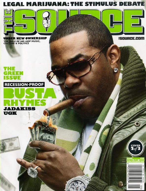
TypographyIn this front cover, the masthead "The Source" is written in big, green, capital writing to make it really stand out and to make sure that people can clearly see the name of the magazine from a far. The main colour theme of this magazine cover is green. This green could be used to represent the colour of money and wealth, used to help promote the rapper Busta Rhymes 'lifestyle. Also the masthead has a drop shadow and stroke effect to make out stand out more and make it more noticeable. On the cover-line, it says the name "Busta Rhymes". You can tell this is an important piece of text as it is coloured in the main colour scheme of the magazine cover , green. Under the cover-line text "Busta Rhymes" is a text that says other rappers name. This is has less significancy than the other as it is fairly smaller and is in black. This could connote that maybe those rappers are not as important as Busta in this magazine issue.
|

TypographyIn this magazine cover, the main cover-line is a text that says "G-Unity". The "G" in the phrase is in script writing and is in a different colour than the "Unit". This could connote that they are prestigious gangsters, as the "G" stands for gangster. Also it is in the same colour as gold and jewellery which could connote their wealth. There is a smaller cover-line under the "G-Unity" that involves the name "50 Cent". This name is coloured in gold as well. Maybe to connote his name as it means money and also to connote his own wealth and love for jewellery. His name is also in block, bold capitals to make it more eye-catching and to show his importance in this issue. The main font colour in this front page is white and gold, however it seems only the important words are in gold. The font does not change much in this front page on the cover-lines.
|
DenotationThis cover magazine is a picture of 4 rappers who make a group called G-Unit. They are all looking at different directions and are wearing black. The text "G-Unity" is the most obvious and eye-catching part of this magazine cover. All 4 rappers are in a mid-shot frame. This cover involves a bar code for scanning.
Mise-en-SceneFor all 4 rappers in this covers, they all seem to have a very serious facial expression and look very angry. There facial expression also tell me that they are very passionate about something (possibly music or money) hence the facial expressions. However, though they all have the same NVC's they have slightly different facial expressions. For example, the rapper on the far left has a more worrying facial expression than the others. Whereas, the second rapper from right to left probably has the most serious face. This could connote he is the most focused member of the group. Not many props are used in this cover magazine, however one of the rappers has a "gangster hat" on which could express his negative background and perhaps a crime related lifestyle. Also another rapper in the cover is wearing sunglasses which could suggest a secretive lifestyle. Not much can be said about their costume apart from the fact that they are all wearing black which could connote very dark and evil characteristics from all rappers. In addition to this idea of dark, evil and gloomy backgrounds from all 4 rappers, the setting and lighting are completely black which again connotes a shadowy past.
Target AudienceI think that the target audience for this cover magazine would be young people who are interested in gangster rap music as the 4 in the cover make up a group called "G-Unit" which means Gangster Unit.
|
DentationThis cover magazine is a picture of hip hop artist Kendrick Lamar. Kendrick has a crown on his head that looks very expensive and is doing a very signature dominant pose with his hand on his chin. This cover has 2 bar codes for different purposes and also has links to social networkings. This cover is called "The Source" and has "The good, the bad and the ugly" written at the top of the page.
Mise-en-SceneIn this cover magazine, the rappers NVC looks very dull and tired. This could connote the fact that he does not get much rest as he is usually making music and performing on tour. His left eye also looks a bit red which could show the lack of proper rest. The main prop used in this magazine cover is his crown the he is wearing on his head. Firstly, the crown connotes dominance, power and respect as it is a king crowns. Secondly, the crown could signify maybe that he is the most dominant in his field of art which is rap music. Lastly, for props, he is wearing a ring that could connote his wealth as it seems to be emitting a lot of light and glistening. Not much can be said about the setting as he is surrounded by a completely white background. In the lighting however, half of his face has a shadow which emphasises and really shows his tired looks.
Target AudienceI think the target audience for this magazine will be other rap artist of the same genre. I say this because it is as if he is trying to send a message to other rappers saying the he is superior to other rappers and the king in his profession.
|

TypographyIn this front page, it seems that the editor used mostly green for the writing, however important names of people are rather in black or white. Also it seems there is a hierarchy order for these names. As Kendrick Lamar is the main subject for this front page his name is in block capitals, bold and in a higher font size than the other text. This could connote his significance in the issue. Other names such as 2 Chainz, Obama and Lola Monroe are less noticeable than the Kendrick Lamar cover-line which could connote the reduced importance of them.
|

TypographyIn this double page spread, the most obvious piece of text is the big letter "J". The letter is in red to make it stand out more in the white background. This could connote the importance of his name in the magazine issue. In addition, the rest of the text is in very small writing which makes it less visible from a far, however the "J" can be spotted from far. On the image of Jay Z , there is a small piece of text in red. This could connote that the most important colour scheme is red and this should be the first thing the reader will pay attention to.
|
DenotationThis double page is dedicated to rapper Jay Z. On the left side is a picture of Jay Z and on the right is several text paragraphs with a big red letter "J" going straight through the middle of the page. It is a close up shot from a slightly high angle.
Mise-en-SceneThe model "Jay Z" in this double page has a very "straight face" facial expression as it looks very neutral. However, this neutral facial expression could connote his seriousness with perhaps money and fame. He is also is wearing sunglasses maybe to hide his true feelings and expression. Not much can be said about his costume as he is only wearing a black v-neck shirt, however, his is wearing what seems to be am expensive chain called a "Jesus Piece" which seems to be very common with wealthy rappers as it sends out a message of riches. The lighting in this image has a red side and a blue side. This connotes maybe Heaven and Hell, Demons and Angels or Good and Evil. This could show that he has a bad side and a good side as it has a red side which is normally associated with horror and blood whilst blue is associated with good and happiness.
Target AudienceI think the target audience for this would be especially for people who are interested in this particular rapper as he is probably the most world known rapper. Also because this double page is created solely to promote him as his mark is everywhere on the pages for example, the big J.
|
DenotationThis double page is split into 2 sections. On the left is a picture of hip hop artist "Kid Cudi". On the right is several paragraphs of textual writing. Going straight through the middle horizontally is a very noticeable title reading "Kid Cudi". There is not many colours in this double page, mainly brown and black.
Mise-en-SceneThe artist facial expression in this looks very calm and clear-minded. This could connote that he is living a very relaxed lifestyle due to his wealth and fortune. However, it seems that this artist does not like to flaunt and show his riches which could connote humbleness in his money. I say that there is a sign of humbleness due to his very plain costume. Most rappers wear very eye-catching and expensive clothing, however, Kid Cudi seems to be wearing common clothing, not promoting his wealthy lifestyle. The lighting is quite dull, maybe to compliment his average and common dress sense. He is wearing a very inexpensive and cheap looking chain. He has a very big tattoo on his arm which could connote and represent something important in his life. Lastly, he is wearing what teenagers call "Nerd glasses" which is thought to look quite nerdy, this could connote that maybe he is not like all the other violent rappers and is quite smart intellectually.
Target AudienceI think the target audience for this would be people who are not very interested in the common violent rap music and instead, are interested in rap which promotes peace and has less violent lyrics to it. I say this because it seems Kid Cudi is a very peaceful artist as he does not promote himself in a violent and money-loving way in this double page.
|

TypographyThe word "Kid" is written in script type font and is in white. The word "Cudi" is written in bold capitals and is black. Together these 2 words will make up the artist name but they are written in separate fonts and colours. This could connote that these 2 words have separate meanings and different importance. The fact that "Kid" is written in script writing could connote his childish side and the "Cudi" could connote his more serious side. However, "Cudi" is more visible and obvious to the reader as is stands out more against the white background.
|

TypographyThe first piece of obvious text you will see in this double spread is the "Man Made" text written in block capitals. This text is much larger than the any other text in the double spread. The "Man Made" text written upside down could connote that maybe they mirror each other and it also gives an illusion effect to make it more eye-catching and appealing. All the text in the double spread is in black to make it stand out more and easier to read against the white background. The subjects name, Rick Ross, is in bold to make it more obvious to the reader about the importance of the subject in the magazine. Also it make it easier for the reader to spot the significant names. Rick Ross 'name being in bold connotes his importance.
|
DenotationIn this double page, is a picture of very wealthy rapper Rick Ross who leads his own music organisation called MMG. He is holding a bottle of champagne and a champagne glass. Hi is wearing a very expensive suit with many balloons in the background. Unlike the previous double pages, there is not much writing as there is only one paragraph. There is 2 pieces of obvious text that says "Man Made". One of them is written normally and the other is written upside down. There is also a small paragraph of writing in between the 2 Man made texts.
Mise-en-SceneAs the picture of Rick Ross on the double page is a long shot and not a mid/close shot, it is very difficult to see his facial expression and NVC. However. from what you can see, it seems his facial expression is very calm and relaxed which could connote that he is living a very relaxed and glorious lifestyle. The props involved in this double page is a wine glass and a bottle of champagne. This could connote a celebration event or some sort of party. The bottle of champagne looks like a very expensive bottle. Expensive champagne is normally bought on special occasions so this double page could be used to promote a celebration for this wealthy man. In addition, he is wearing what seems to be a celebration suit and not a formal suit, this links back to the idea of a celebration. In the background, you can see many party balloons which supports the view that he is celebrating perhaps his wealth. The lighting seems to be very bright which allows the reader to see every detail of his costume and props. Although it is a long shot picture, the lighting makes up for the lost detail.
Target AudienceI think the main target audience for the double page is young adults. I say this because this double page promotes celebrating and partying with very expensive champagne bottles, and this can relate to young adults who usually celebrate in this way.
|
DenotationIn this double page is a picture of R'n'B singer Rita Ora. The picture of Rita is mainly in the left side on the double page, however, a bit of her foot is involved in the right side of the double page. There is big red writing going through both the left side and right side of the double page reading "Rita Ora" in big bold capitals. There are several paragraphs in this double page and some of then have red writing. Rita seems to be sitting on the floor behind a brick wall painted white.
Mise-en-SceneThe picture in this double page is a long shot picture allowing us to see her whole body whilst at the same time, viewing her NVC. Her non-verbal communication in this picture looks like a very serious and brooding facial expression. This could connote that maybe Rita has a lot on her mind as a famous singer. There is also a hint of curiosity in her facial expression. For her costume, she is wearing a beanie hat, something a lot of teenage girls do. This could connote a bit of her youthful mind and fashion sense. In addition to her costume, she is wearing a long top just going down to her hips, this could again, connote her youthful thinking sense. She is also wearing trainers. All this could connote that maybe she does not like buying very expensive and flashy clothing and instead prefers to keep it simple and in-style. The setting of this picture looks very dull and un-lively, as though her scenery is lacking life. This could connote her past as she seems to be against a brick wall that looks as if it was from a money deprived area.
|

TypographyThere are several paragraphs in this double page and some of them have red writing. This could possibly be a sign of the more important paragraphs in the double spread. In addition, the name "Rita Ora" is written in red capitals and covers both sides of the spread. This could connote the significance of her name in the magazine, also it will be the first text the reader will see which means it has to be easy to read and intriguing to the customers.
Target AudienceI think that the target audience for this would be teenage girls. I say this because many teenage girls could relate to Rita Ora's dress sense and style. I also say this because a double page like this would not attract boys but rather females.
|
Convention Diagrams
These convention diagrams point out and highlight what needs to feature in a magazine front,contents and double page spread. The convention diagrams also say why it is useful to use on magazines. All these features is what makes up the front, contents and double page spread.

|

|

|
Audience Research
In order for me to create a magazine that meets all requirements of my target market, I will need to plan out some research involving 20 questions. These 20 questions will be asked to my target audience range through approaching them on the street and social networking such as Facebook, Twitter and WhatsApp. The 20 questions will be organised as 10 front cover questions and 5 for contents page and double spread page. All the information I gather will allow me to create an accurate magazine that relates to my target audience.
Front Page Questions
1. What gender are you?
Boy / Female
2. How old are you?
13 - 16 / 17 - 20 / 21 - 24 / over 25
3. How much will you spend on a magazine?
£0.99 / £1.99 / £.2.99 / £.3.99
4. How often do you buy magazines?
Daily / Weekly / Monthly / Other
5. What gender would you prefer to see on the front page?
Male / Female
6. Would you like a neutral background or engaging?
Neutral (Black or White) / Enagaging (Objects)
7. Would you like an online version?
Yes / No
8. What shot would you prefer?
Close-up / Mid-Shot / Long-shot
Close-up / Mid-Shot / Long-shot


9. What title do you prefer for the front cover?
Urban POP! / Muzik Mag / Takeout / Imperial LDN
Urban POP! / Muzik Mag / Takeout / Imperial LDN
10. From the following front covers which do you like ?
1 / 2 / 3 / 4
1 / 2 / 3 / 4

|

|

|

|
Create your free online surveys with SurveyMonkey , the world's leading questionnaire tool.
https://www.surveymonkey.com/s/LZ8QVWV
Results/Answers
Contents Page Questions
1. How many images should the CP feature?
1 / 2 / 3 / 4 / 5 or more
2. Should the CP involve advertisements?
Yes / No
2a. If yes, should it be music related?
Yes / No
3. Should there be a competitions and games section on the CP?
Yes / No
1 / 2 / 3 / 4 / 5 or more
2. Should the CP involve advertisements?
Yes / No
2a. If yes, should it be music related?
Yes / No
3. Should there be a competitions and games section on the CP?
Yes / No
4 . What font do you prefer for the contents page?

Create your free online surveys with SurveyMonkey , the world's leading questionnaire tool.
https://www.surveymonkey.com/s/VVCBKTL
Results/Answers
Double Page Questions
1. Would you like an interview and quotes to be involved?
Yes / No
2. What gender would you like on the DPS?
Male / Female
3. Should everything be music related on the double page spread?
Yes / No
4. Would you prefer the main image take up most of the page spread?
Yes / No
5. What shot should be used for the main image in the DPS?
Close-up / Mid-shot / Long-shot
Yes / No
2. What gender would you like on the DPS?
Male / Female
3. Should everything be music related on the double page spread?
Yes / No
4. Would you prefer the main image take up most of the page spread?
Yes / No
5. What shot should be used for the main image in the DPS?
Close-up / Mid-shot / Long-shot
Create your free online surveys with SurveyMonkey , the world's leading questionnaire tool.
https://www.surveymonkey.com/s/DZ8FSQ5
Results/Answers
Social Network Evidence

My "Imperial LDN" Reader Will Be ...
Basic Information
Male
|
Name : Joseph Reid Age : 19 Ethnicity : Black British / Caribbean Hobbies : Recording and Writing, Rapping, Playing Sports , Attending Concerts, Clubs and Party's Occupation : Customer Assistant At Waitrose Favourite Genres : Rap , Hip-Hop , Pop and R&B Education : University in Luton |
Hobbies and Interest
|
Joseph Reid is interested and mainly focuses on his music career. This is what takes up most of his time as he is really passionate and dedicated in making and producing music. The genre in which he produces, writes and raps to is hip-hop and rap. He prefers to be inspired and tries to imitate some of his favourite artist rap and producing styles to match their own.
|

|

|
In order to improve his current music passion, he enjoys listening to rap and hip-hop music in which will all be featured in my magazine. He regularly attends concerts along with his friends as he enjoys the atmosphere of being around people who share his music interest.
|
|
In addition, he likes to go raving/clubbing with his friends. He prefers to go to clubs which play all types of genres to get a better understanding of different genres. Also, it is a fortnightly routine to go partying with his friends and it has almost become like a tradition.
|

|
|
|

|
Fashion and Style
|
Joseph has based his fashion sense around various different hip-hop artists and he also adds a bit of his own style. As slim fit trousers are becoming very popular and stylish, he prefers to wear them all the time. His main favourite colour is grey but this varies depending on his outfit.
|
|


Basic Information
Female
|
Name : Paris Jones Age : 24 Ethnicity : Black American Hobbies : Modelling, Clubbing, Listening To Music, Travelling, Experimenting Make-up, Going Gym Occupation : Amateur Model Favourite Genres : Hip-Hop , Pop , Dance and Bashment Education : Finished University |
Hobbies and InterestParis hobbies include travelling a lot and working out and this causes her to listen to music much more often than usual. Because her favourite genre is hip-hop, she mainly listens her favourite artist Nicki Minaj along with many other artists.

As Paris is a amateur model she is very passionate and likes to keep up with her fitness. She attends gym regularly and likes to listen to various hip-hop artist to keep herself occupied whilst she is working out.
|
|

Fashion and Style

Paris 'fashion sense and style is mainly inspired by the rap and hip-hop artist she listens to. Because she has a job in modelling, she has enough money to keep up with the modern fashion. She bases most of her fashion sense on Rihannas urban and classy style. Along with the flashy jewellery like the ones Nicki Minaj wears.

|


|
Moodboard
This mood board was created in order to express my overall view on hip-hop music and all its most important aspects.

